Composition
Moving away from the math for a bit, lets talk about something much more subjective. Much has been written on the subject of coming up with what could be largely considered a pleasing composition. The problem of seeing something beautiful, taking a picture of it, and not understanding why your picture is so disappointing when your subject was so inspiring, is generally a problem of composition. There are a few basics to composition that every photographer (and artist in general) should have a firm understanding of. I'm only going to briefly go over the few that I pay the most attention to: the rule of thirds, patterns, leading lines, implied motion, and subject isolation.
The rule of thirds isn't so much a rule as it is a suggestion, but everyone calls it the rule of thirds, so if you go around calling it the suggestion of thirds, you're liable to catch some funny looks before people figure out what you're going on about. The rule itself is actually two rules. The first of which is: attempt to place the horizon at either the top or bottom third of the frame. This is, in general, more visually pleasing than placing the horizon in the center, which is what most beginning photographers are apt to do, and commonly referred to a split horizon. There are, of course, times when a split horizon is the best answer (usually an image where reflection is the primary subject), but those cases are more rare than when a rule of thirds composition will produce a superior result.
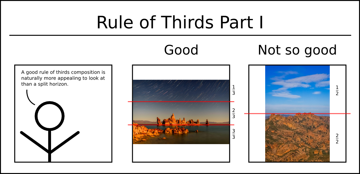
Notice how in the "Good" frame, the horizon almost perfectly lines up with the bottom third, allowing the stars above to occupy the top two thirds of the image, where as in the "Not so good" frame, the mountains and sky are nearly perfectly divided at the middle of the image. This is what we call a split horizon. Good "rule of thirds" compositions are naturally more appealing.
The second rule of thirds urges you not to place the focal point of your subject in the center of the frame (another common beginner "mistake"). Instead, place the focal point of your image at one of the four intersection points between the horizontal and vertical thirds of the frame. Centered compositions certainly have their place, but try offsetting your compositions to one of the four "thirds" points and see if you don't find them a bit more appealing. To assist with this, turn on the grid lines in your viewfinder. To this day, I leave the grid lines turned on. Maybe I'm just lazy, and/or thick-headed, but the constant reminder of seeing the lines overlaid on the scene really helps create more visually appealing compositions.
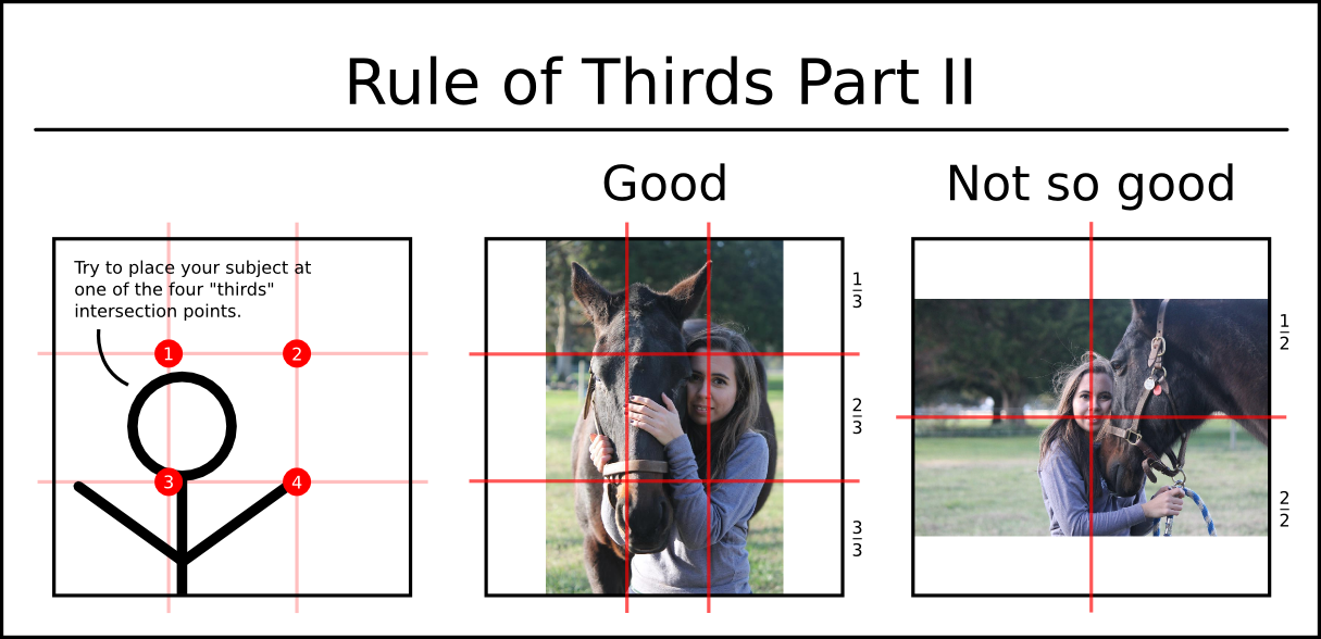
As I was writing this section, a good friend asked me to critique a few pictures she had taken. When she took these images, she had no concept of the Rule of Thirds, yet managed to produce near perfect examples of what to do and what not to do. Notice how in the "Good" image, the horse and the girl's face line up almost exactly on the vertical third lines. For a more perfect example, the girls face would have needed to be a bit higher in the frame, but unless they brought a step stool with them, that may have been difficult to acheive, so I'd still classify this as a good rule of thirds composition. The "Not so good" image is a clear demonstration of a beginner's tendency towards centered compositions. When you divide the frame evenly, the girl's face lands directly under the crosshairs. It doesn't get a whole lot more centered than that. Notice how almost the entire left half of the frame is empty. This is an excessive amount of negative space that isn't really doing anything for the image. To fix this, you could easily crop the image, making it a bit narrower so that the girl's face was on the left third divider. This is exactly why I leave the gridlines turned on in my viewfinder. If I were shooting these images, I would have put the girls face right on one fo the "thirds" intersection points and gotten a near perfect rule of thirds composition in each shot.
Patterns are a bit of an abstract subject to try and talk about, but our eyes are drawn to repeating patterns. If you see one, then not only have you just proved the previous statement correct because you saw it, but it's also liable to make a decent picture. Try to figure out what caught your eye about it, find an interesting angle, and take a picture of it.
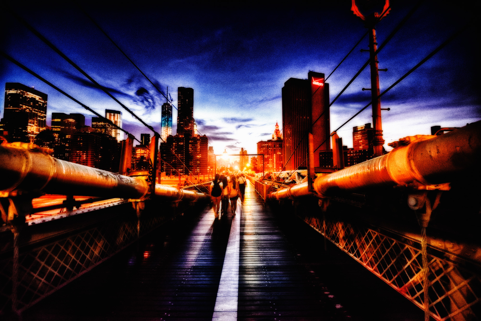
Leading lines are your way, as a photographer, of telling the viewer of your image how to look around it. Think of the classic image of Highway 66 leading off into distance. The edges of the road contrasted against the desert constitute leading lines. Your eyes will naturally follow those lines to their conclusion. Your job is to place something interesting at the end of your leading lines, so the eye's journey is worth the effort. If you can combine leading lines and patterns, you're really doing it right. It's more difficult to find examples of this in nature, but it's all over the place in architecture. It's one of those things where the more you look for it, the more you'll find it.
Implied motion is another of the more abstract concepts. Imagine a runner moving across your frame to the left. If you place him on the left side of the frame, it would look as if he were about to run into a wall, that wall being the edge of your picture. Aside from just looking funny, this will actually cause a minor amount of stress in your viewer. If, instead, you place the runner on the right side, then they have the entire frame to run across. By giving the runner room to move, the stress is removed and a pleasing composition is achieved. Always leave room in your frame for moving subjects to move into.
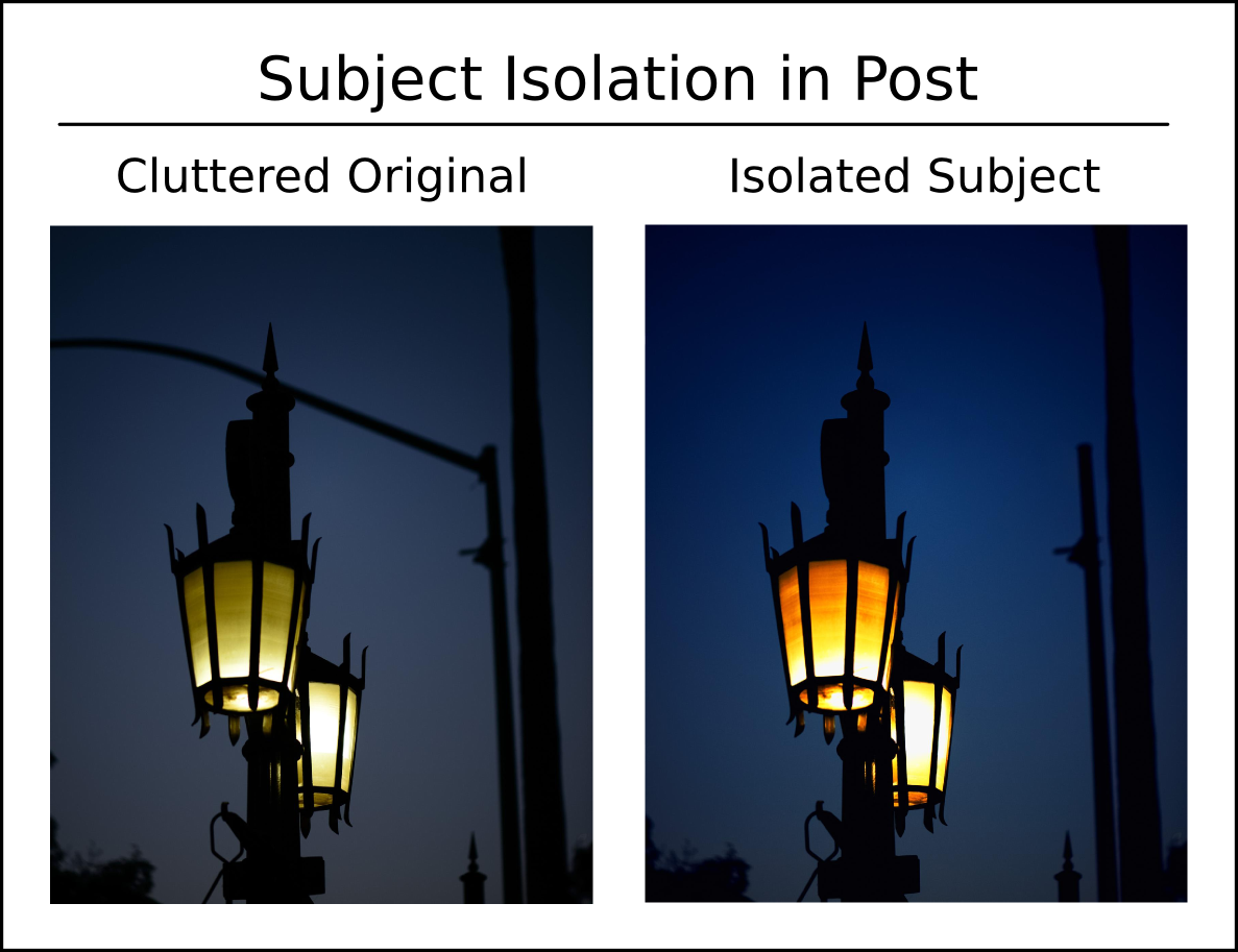
Painting is the art of inclusion. Photography is the art of exclusion. Just as the painter must decide what to include in his work, the photographer must work to exclude what does not belong. It is ultimately your job to clearly convey why you chose to actuate the shutter. If you're photographing a stream, you wouldn't take the picture with a bunch of tree branches randomly obscuring the view. Everyone's seen the picture of a friend taken on the street where they have a light pole coming out of the top of their head. Every picture is trying to convey something worth looking at. Don't put something in the way of what you're trying to show.

The best way to do this is to isolate your subject. Artistically speaking, this means ensuring enough negative space exists between your subject and anything else in the frame. Take a look at the above image "Enter the Fog." This image works well because of the proper use of negative space. Imagine how much less interesting the image would be if I'd waited another 10 seconds and the cargo ship were partially obscured by the bridge. Also, I placed myself so that the bright red tower and its cables are set on a dark green background. If I'd been farther to the right, the bridge tower and cables would have been lost in the visually busy city behind it.
There is nothing worse than a sharp image of a fuzzy concept.
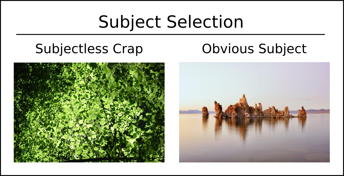
All of that being said, when taking a picture, before you fire the shutter, take a second look through your viewfinder and make sure you image has a clearly defined subject. This is a more serious problem for beginner nature photographers than anyone else. We tend to walk into the woods, become astounded by everything we see, and start shooting away. Surely every leaf and branch are unique, thus we must get a picture of every single one! Ok, slow down and take a breath ... maybe two or seven, as the case may be. Listen to Mr. Adams. If the viewer of your image can't point to the subject of your picture without having to contemplate the complexity of the light interaction between the mass of leaves you're trying to pass off as a photograph, you're doing it wrong. Your subject should be so obvious it jumps out and smacks the viewer. I had such a problem with this when I was first starting, I had to start telling myself to stop taking pictures of "subjectless crap" whenever I went out shooting. To clearly demonstrate this, I went deep into my archives to find one of the worst examples of a subjectless image for you, and somewhat randomly picked my "good" image. Hopefully the difference here is obvious.