How to use the Histogram
A histogram is a visualization of the brightness levels in your image. The higher an area of the graph, the more often that brightness level appears in your image. Histograms are typically broken up into 5 regions:
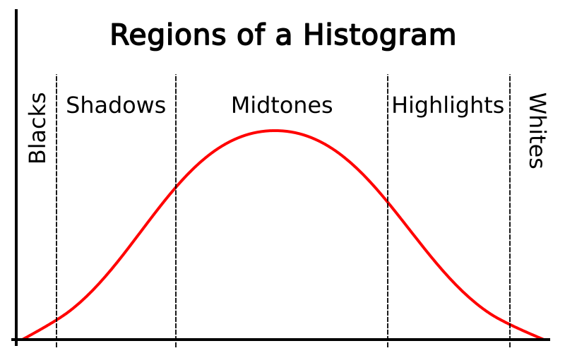
The most important regions to pay special attention to are the far left and far right, "Blacks" and "Whites", respectively. A peak on the far left is true black. A peak on the far right is true white.
In camera, we use the histogram to judge proper exposure. In post, we use it for a lot of other things, but we'll get to that in a bit.
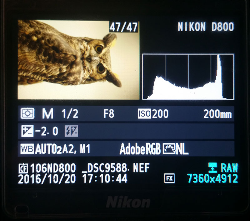
Here's an in-camera example from my owl portrait shoot:
Defining proper exposure can be difficult for artistic reasons, but from a strictly technical perspective, it's quite easy. Look at the histogram and make sure it's not slammed up against either side. An underexposed image will have a histogram that's shifted to the left, while an overexposed image's histogram will be shifted to the right.
For the following examples, I start with a properly exposed image's histogram. Then I change the exposure to show under and over exposure. This shows you how that image's histogram looks under different conditions.
The LCD on the back of your camera is bright, which can make it hard to judge the actual quality of your exposure. A quick check of the histogram will tell you whether you nailed it or not.
The most important thing to check for is blown highlights. True blacks are generally more acceptable under most circumstances than true white. But, if either one is present in your exposure, you won't be able to recover any detail from those portions of the image. Note how in the third example above, the histogram is shoved up against the far right side and the arrow in the top right corner is lit. That indicates blown highlights. Had that been the original exposure (instead of being a product of me adding a few extra stops of light for the purpose of the example), there would have been a large portion of the image that would have been pure white and there's nothing that I could have done about it.
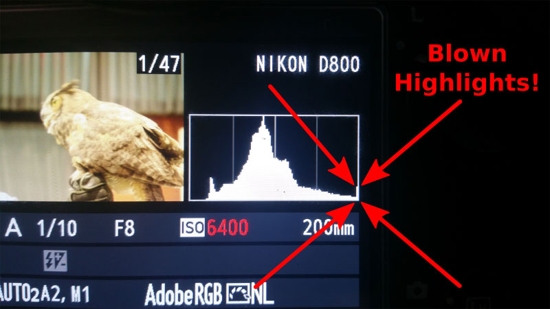
Here's the rub though: the histogram you see when you look at the back of your camera is NOT the histogram for the RAW file. It's the histogram for the JPG the camera generated to display your RAW. In practice, that means it's possible to see blown highlights on the back of your camera, but not have blown highlights when you import your image into Lightroom. Without custom firmware loaded into your camera (which I absolutely do not recommend messing with), there is no way to see the histogram of your RAW file.
The amount of blown highlights you can have in your in-camera JPG and still have recoverable highlights in your RAW is entirely dependant on your camera settings. If you tell it to crank the contrast to make your in-camera shots look punchier, knowing that because you're shooting RAW it can all be adjusted later, you're doing yourself a real disservice. By bumping up the contrast, you'll blow your highlights faster than with the contrast set at 0 (or negative). Pushing your contrast as far negative as you can is about the closest you can get to ensuring your JPG preview's histogram isn't lying to you (too much) about whether you've blown your highlights or not.
In general, most people prefer looking at more contrastive images, so the downside to dropping your contrast is that your in-camera preview images will be disappointing visually. The upshot is that you'll be able to see more shadow and highlight detail. Being able to judge the level of detail captured and accurately assessing whether you've blown your highlights is vastly more important in the long run. Thus, it's ok to initially be a little disappointed in your preview JPGs, knowing that you have a technically correct capture that you can work with in post.
Let's walk through a full example:
You can clearly see that a good portion of the sky is blown out. In theory, that means it will be pure white and will have no recoverable details in it. Let's see if that's true ...
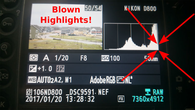
To show why this is so important, let's look at a really extreme example:
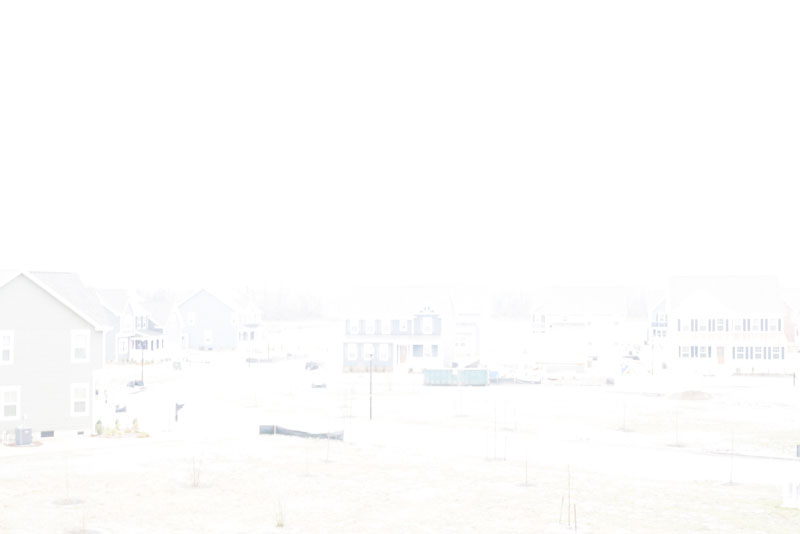
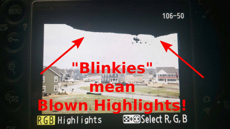
This exposure is unarguably terrible. To demonstrate just how bad it is, here's the "blinkies" version:
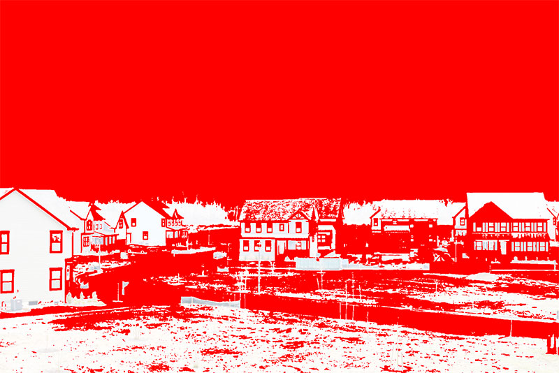
That means, everywhere that's red in the above image is true white. No detail can ever be recovered to improve the image. Case in point:
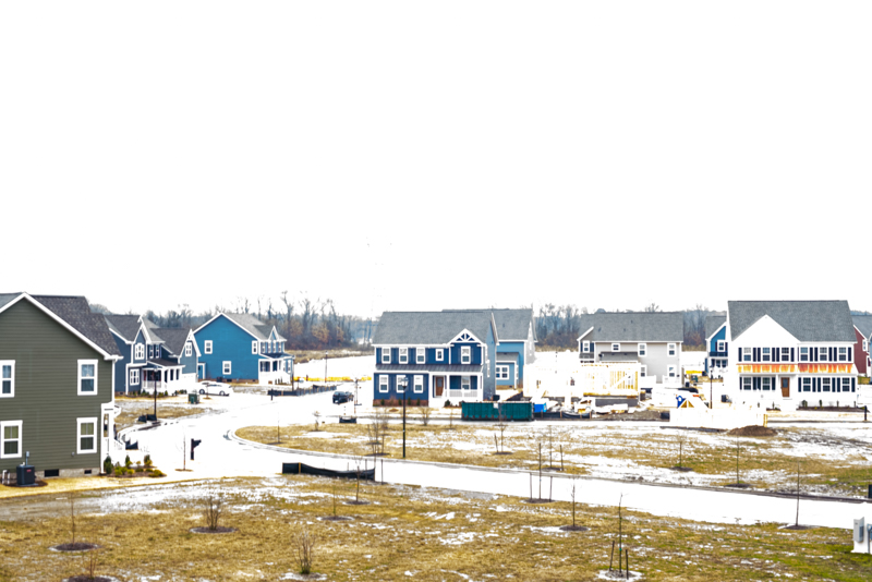
As you can see in the final, edited version, large portions of the image remain pure white. There's simply nothing that can be done about that.
Protip: Don't blow your highlights!
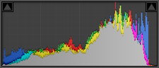
Histograms are just as important in post as they are in-camera. And, Lightroom's histogram isn't a lie, which is a big plus.
Initially, you can use it to judge exposure, just like you did in camera, and for the same reason. Your monitor is bright. That can make it hard to judge proper exposure. Look at the histogram for a definitive answer. But, because we're now in post, what is and is not a proper exposure has become artist's choice. If you're going for a low-key mood, the histogram is going to look underexposed (because it is). Similarly, if you're going for a high-key image, the histogram is going to look overexposed, again, because it is.
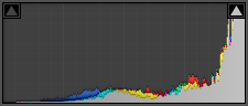
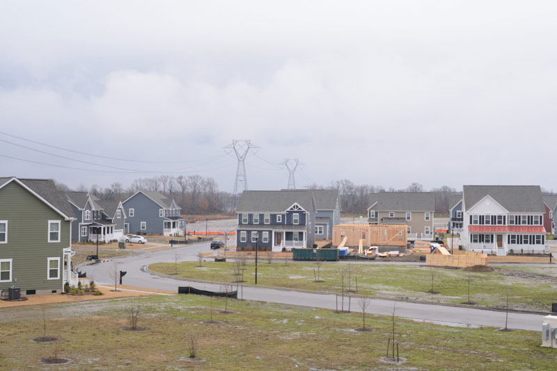
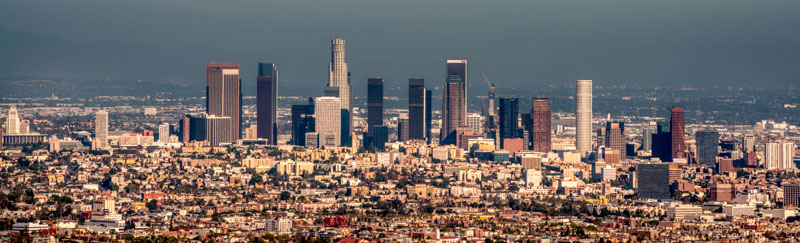
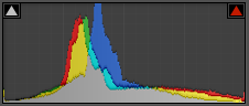
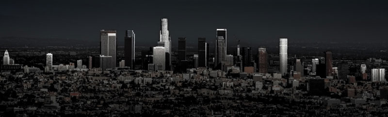
What the histogram is most useful for in post is judging blacks and whites. With landscape photography, (in general) you want to capture as much dynamic range as possible. That means pushing the histogram to the absolute limit on both sides. To illustrate this, let's look at an example from Los Angeles:
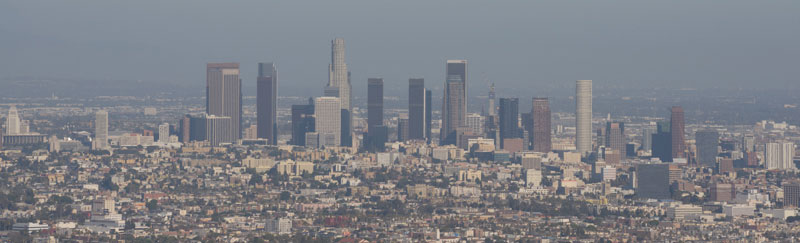
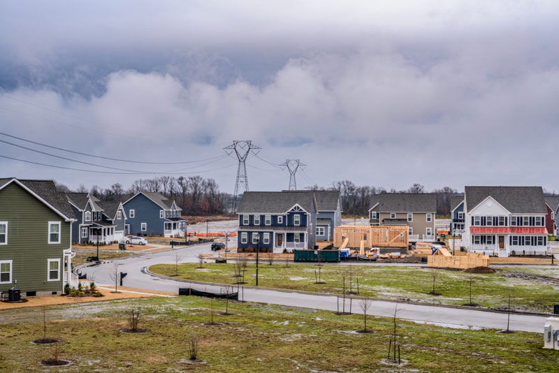
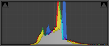
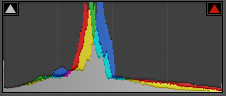
Your first thought when looking at this image is noting how low contrast it is. Let's look at the histogram to confirm this:
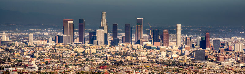
Let's see if we can improve things:
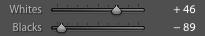
Stretch your histogram by pushing down your black levels and gently nudging up your white levels. Do it by eye at first, then check the histogram to make sure you're not blowing out parts of your image you want to keep.
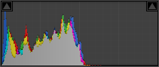
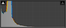
The edited version's histogram is telling us a couple of important things. Try to figure out what they are before reading on ...
- The image is now much more contrastive (the histogram is wider).
- The image has true black in it (the peak on the left side and the bright grey triangle in the top left corner).
- The bright grey triangle indicates that all three channels are at 0, giving us true black. Compare this to the next point:
- There are highlights that are almost blown (the red peak on the right side and the red triangle in the upper right corner).
- The red triangle means only the red channel is maxed out, but there's still room left in the green and blue channels (though probably not much, be careful).
- The peak in the middle has shifted left, meaning the subject of the image is now darker than in the original image.
- This is also apparent if you compare the edited version to the original.
Point #4 is the only one that's of real concern, so let's see if we can do anything about it:
I upped the exposure and further darkened the sky, but looking at the histogram, it turns out I was wrong. The giant peak isn't the subject, it's the sky! So, I'm inclined to argue that the previous version was better. And thus, an important lesson: your editing should be guided by your artistic vision, not the histogram.
And, looking at both edits again, I can't say that I'm really happy with either. Sure, I did a decent job rescuing a terribly hazy skyline shot, but I turned it into little more than a nice snapshot. Let's see what I can really do with this image ...
Much better. What I wanted to do with this image was show the skyscrapers in stark contrast to both the sky and the surrounding metropolis. The earlier versions didn't accomplish that aim. This version does. The other versions didn't make me feel anything when I looked at them. This version has real expression to it.
So, long example short, in post, the histogram is great for making sure you're expanding the contrast range to the absolute limits, and not so great at giving you artistic direction.
As a matter of procedure, I'll edit an image to the point where I'm happy with how it looks, then start looking at the histogram. If the histogram isn't as wide as possible, then I'll try pushing down the blacks and/or pumping up the whites to see if I can stretch the histogram to its limit without appreciably changing the overall feel. Why do it if it doesn't change the image much? Because I want my images to be as contrastive as possible for maximum impact. And, while it may not have a big impact on screen, it can make a huge impact when printing.
Ultimately, it's the print that matters most. You never want someone to be wowed by an image on your website, buy a print, and be disappointed by the low contrast rendition you shipped them because you didn't stretch your histogram to the limits.
Now it's your turn. Go see how stretching the histogram changes your images. Paying more attention to the black and white levels will produce punchier, more impactful imagery. Try it out!