Micro Contrast vs Macro Contrast
Micro contrast is easy. Let’s take this close in crop of my image of a lion statue for example:
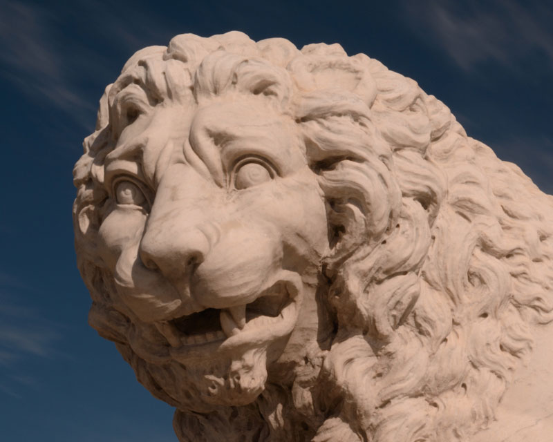
Crank up the the clarity slider and you’ve added micro contrast:
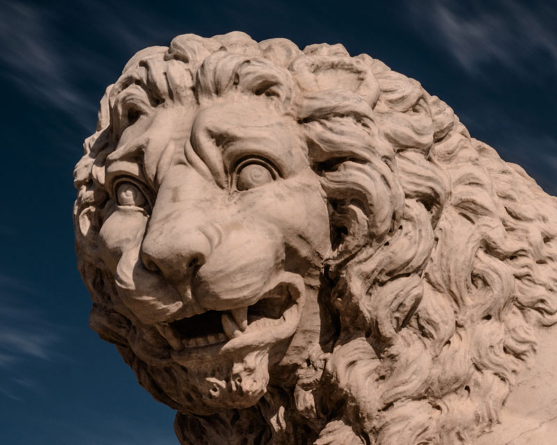
It’s just a filter. Exactly zero artistic effort was required. I know this because I was (and still am on occasion) extremely guilty of reaching for the clarity slider as a quick way of adding punch to an image. Micro contrast isn’t bad, but it doesn’t express vision. In fact, it often expresses a lack of vision. It’s something to use when you’re not sure what else to do. I challenge you to add punch to your images without using the clarity slider.
This is where the concept of macro contrast comes in. Macro contrast is hard. It requires changing the tonal relationship between the objects in your image. The lion statue can be broken down into 4 major objects: sky, face, mane, and body. There are of course any number of ways of breaking down the image. You could go smaller, i.e. nose, eyes, teeth, cheeks, individual hair curls. Or, you could go larger: just sky and lion. This is a decision that you’ll have to make as the artist.
And that, right there, is the difference between micro and macro contrast: Micro contrast requires no decision on your part. Macro contrast requires you, as the artist, to decide which regions in your image you want to change the tonal relationship between.
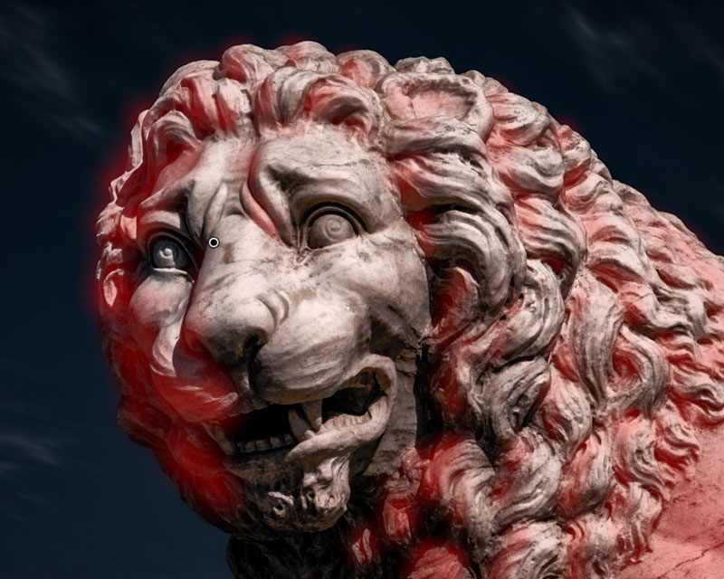
In the Straight out of the Camera version and the enhanced clarity version, the highlights on the lion were all around the same brightness level. Specifically, look at the face, mane, and body. No difference, right? It looks flat. So let’s have another go at the lion and see if we can change some tonal relationships:
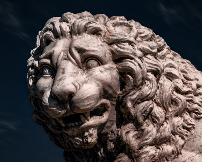
That’s definitely an improvement. The sky has been considerably darkened, but we haven’t solved the problem of the face, mane, and body all being at about the same brightness level. Let’s have one last go at it and see if what we can do:
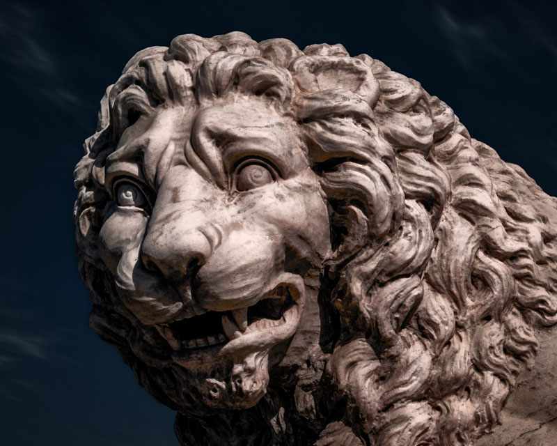
Ah, there we go. Now, the face is the brightest, mane is (an admittedly close) second brightest, and the body is noticeably darker. The face is now the focal point of the image, the hair curls have a lot more depth to them, and the statue as a whole has a lot more depth to it. It no longer looks flat. The lion’s deeply concerned facial expression is now front and center to the viewer.
I don’t know what’s troubling the lion, but by changing the macro contrast of the image, we’ve given it presence, we’ve given it ambiance, we’ve changed the demeanor. The image is now expressive. And that is the ultimate goal. If your image doesn’t express something, then it’s just another pretty picture. Making an image express something requires changing tonal relationships between objects in the frame, it requires macro contrast.
But how? How do I achieve such an effect?
In Lightroom, you’ve only got one option: the Adjustment Brush.
In Photoshop, you’ve go so many different options, I could dedicate an entire chapter just on the subject.
So, lucky for you, I did the heavy lifting for this image in Lightroom. Here’s the mask:
The best way to learn the adjustment brush is to experiment, so I leave it to you to go forth and test your creativity!
Live Somewhere Amazing
The 3 Phases of Photographic Development