Transforming Sunny into Ominous
The goal of the fine art photographer is to express a mood, a feeling, share your frame of mind with your viewer and cause them to experience the same emotion you felt when looking at a scene. Unless you work in a studio and control every element of the scene, this is essentially impossible to achieve in camera. Thus, we rely on post production to transform what we captured into what we want to show. To demonstrate this concept, I’ll walk you through how I transformed a bright sunny afternoon in Washington DC into a dark and ominous scene. Along the way, we’ll discuss tonal separation, bayer filters, foveon sensors, layer adjustments, masking, stacked masks, the keystone effect, and readying an image for printing, so pack a lunch, strap in, and enjoy the ride!

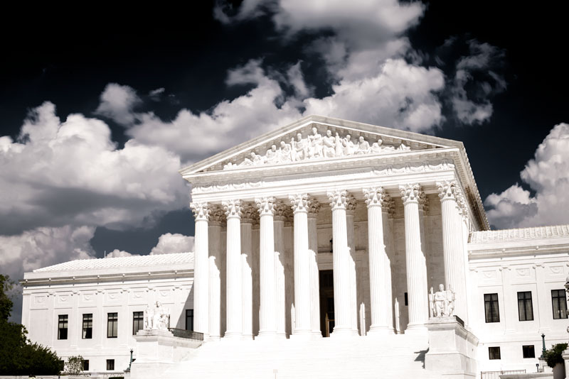
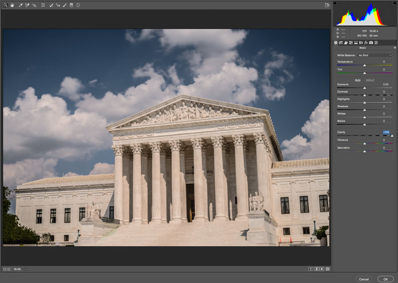
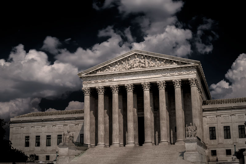
I wanted to at least get 30 seconds, but it was so bright outside, I was blowing highlights and didn’t want to stop down any further.
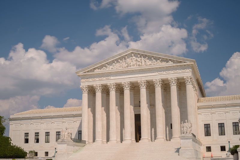
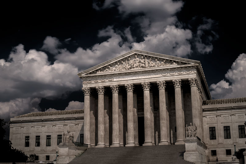
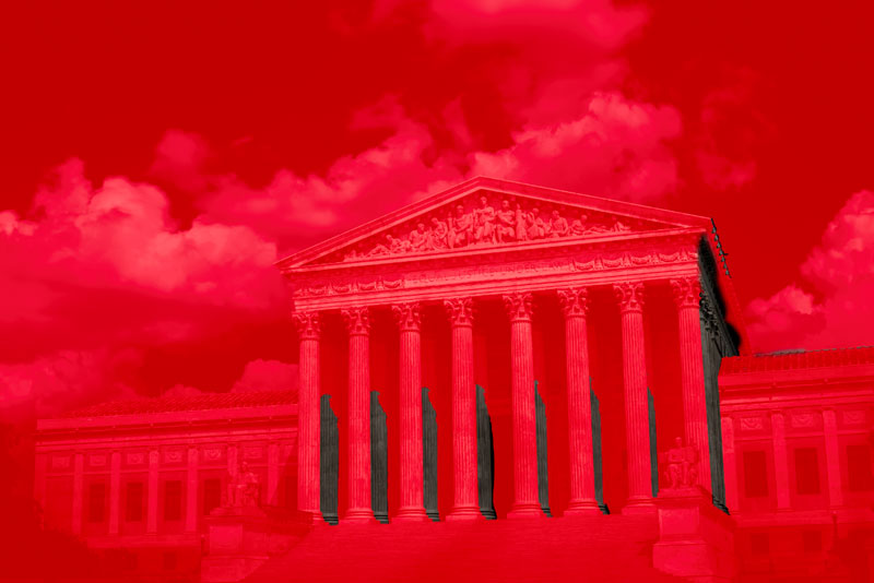
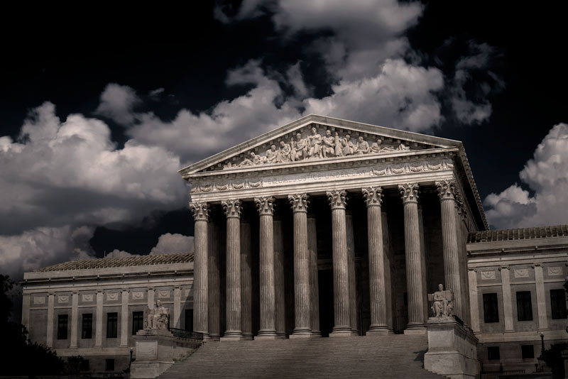
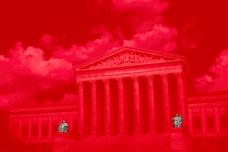
What’s your first impression of the image? Does it impart an emotion? Unless you have experience with the Supreme Court or are a fan of the architecture itself, the exposure probably doesn’t do anything for you. That’s ok. It’s a technically correct but decidedly boring image.

Final touches in Lightroom
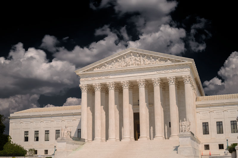
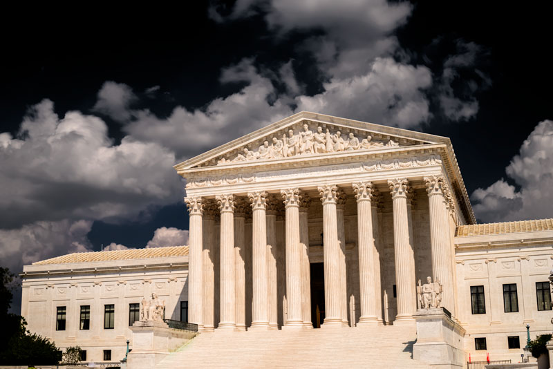
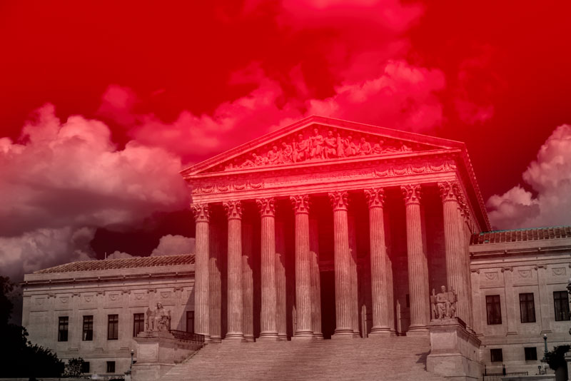
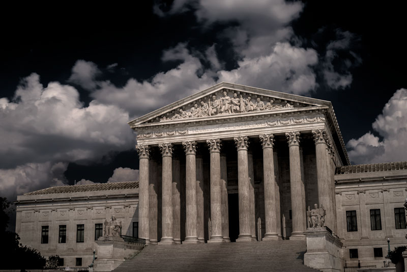
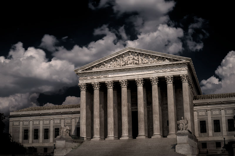
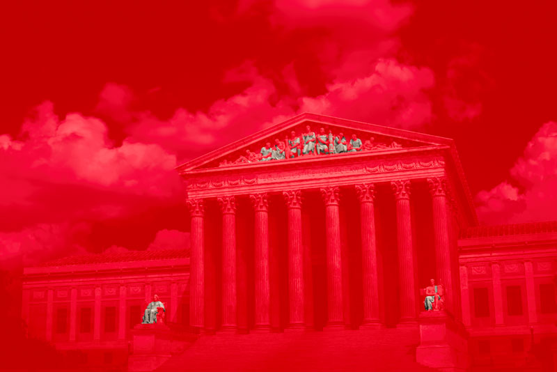
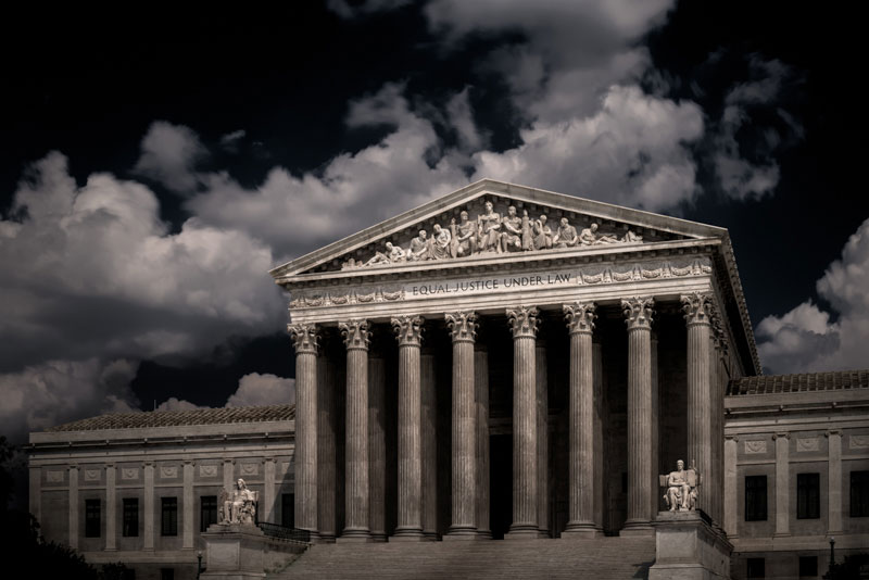
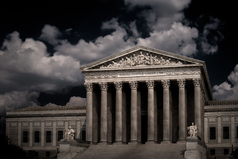
How about now? For starters, do you like the direction I took the image? Does a darker visage better fit the ultimate court of the land? I, of course, think it does. The decisions that are made here can and have massively impacted the direction of the country. Thus, I wanted to give the building an ominous overtone to show the awe and respect I have for it and the power it wields.
So, how did I do it? How did I transform a bright and sunny afternoon into a dark and foreboding scene? Let’s dive in!
The first thing I always do is scene simplification. I remove any distracting elements whose removal won’t fundamentally alter the scene. I don’t want to remove so much that it looks staged. Ideally, I wouldn’t need this step, but the police probably would have gotten upset if I started moving their signs and cones around, so Photoshop it is. Content Aware Fill and the Content Aware Patch tool did the heavy lifting here.
Wouldn’t it be nice if there were a “Darken Sky” button. That alone would save so much time. Seriously Adobe, if you’re reading this, get on it ;)
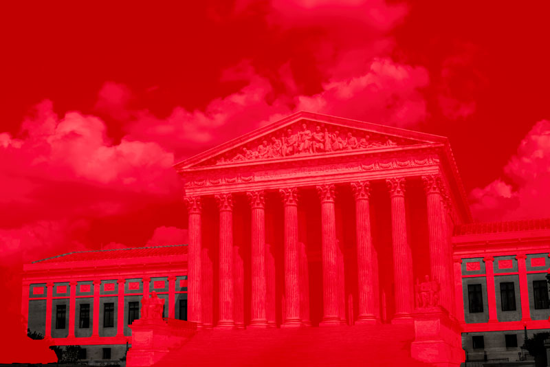
I don’t know why, but I seem to invent a new way of darkening the sky every time I do it. This time, I combined a few different adjustments to achieve the final effect.
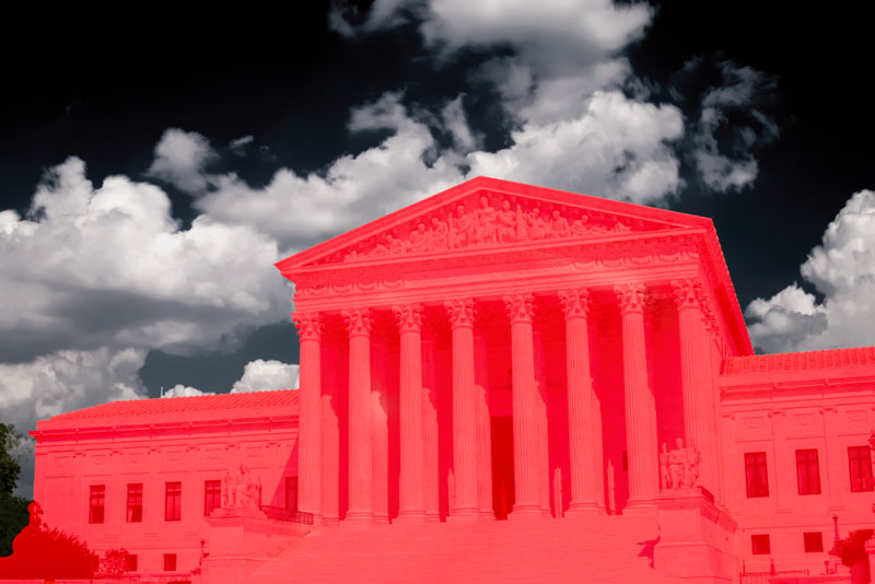
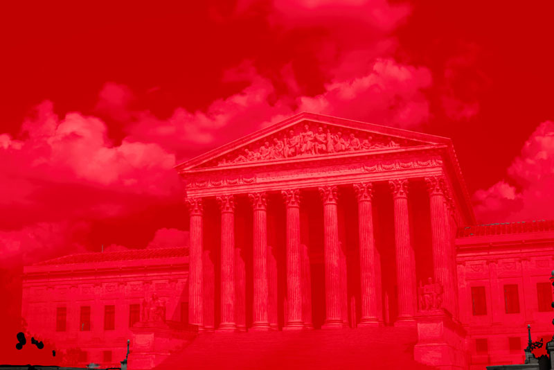
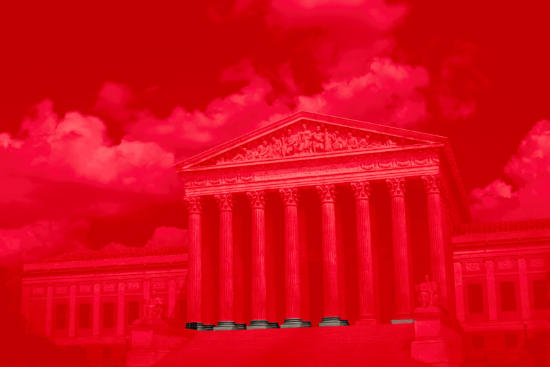
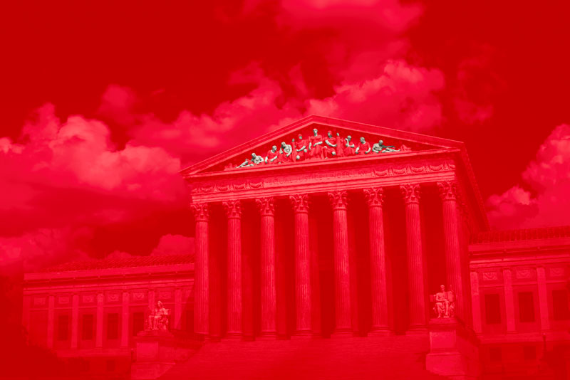
First, I added a Black & White filter:
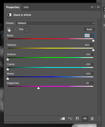
It’s essentially a deep red filter. Ansel Adams was famous for using red filters to darken his skies. That works great on film. On a digital camera with a Bayer Filter (this is most of you), if you use a red filter, you’d only be using about 25% of your sensor’s pixels to capture the scene. So, do your color filtering in post.
If you have a camera with a Foveon Sensor, you should be able to use color filters without the aforementioned 25% sensor utilization problem. I say “should” because I don’t own one, so don’t take my word for it.
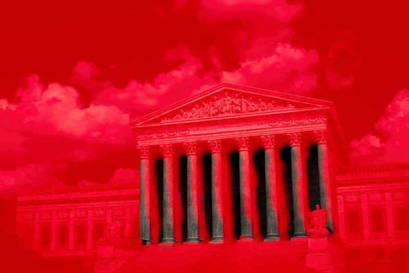
Here’s the result of the deep red filter:
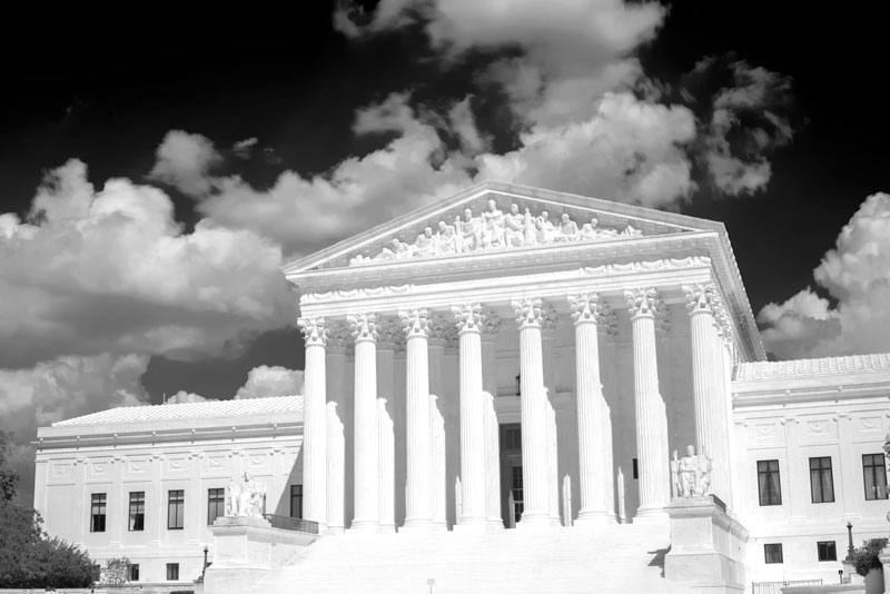
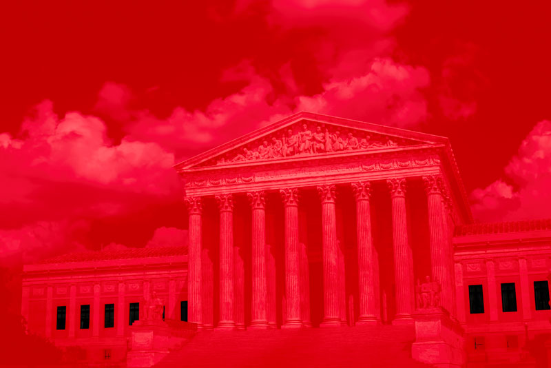
Man, that sky looks good, doesn’t it? But, we’re not going for a Black & White image, so I changed the Blending Mode to Hard Light. How did I know to use Hard Light? Simple, I didn’t. I cycled through every blending mode and picked the one that looked the best. Experimentation is always the answer when you know what you want, but don’t know how to get there.
Hard Light:
We’ve managed to keep the blue tones in the lighter areas and the high contrast of the deep red filter. Perfect.
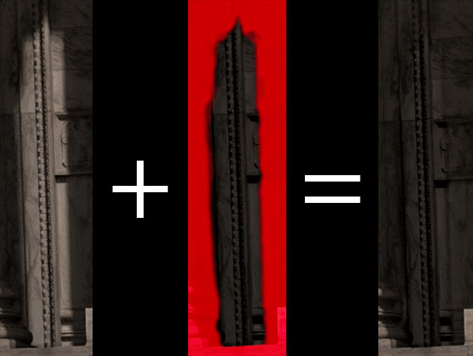
Since this is only for the sky, I masked out the building:
Creating masks is a (massive) topic in and of itself, so I’m going to apologize for glossing over the details and move on.
After masking:
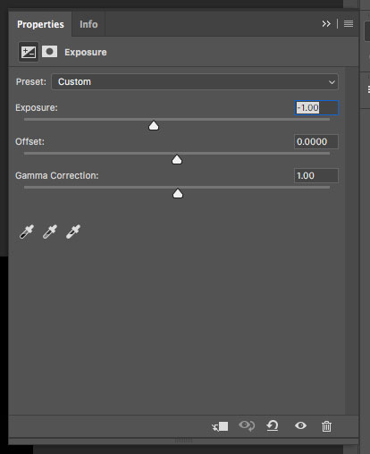
We have achieved the goal of darkening the sky. But, the deep red filter has made the sky extremely contrasty. While a neat effect by itself, the clouds are not the subject of this image, so I used an Exposure adjustment and knocked a stop and half off.
Result:
That looks better. We’ve retained the drama of the deep red filter, but now the sky is very definitely part of the background and won’t fight with the subject for the viewer’s attention.
Ok, where to begin? There’s a lot of work to be done. The building is tonally flat. From left to right, the only variation comes from the shadows, but even still, the columns in the second row and back wall are just a bright as the front row. The stairs are just as bright as the roof. All of this is unacceptable.
First, let's add some clarity. Clarity makes everything look better, right?
Wait, Photoshop has a Clarity slider?! Well, not exactly. Go to Filter->Camera Raw Filter and it will look suspiciously like Lightroom. But, unlike Lightroom, these edits aren’t non-destructive. Once you apply 100% clarity, there’s no going back. So, anytime you use something like this, make a layer copy and apply the Camera Raw Filter to the copy. That way, you can control the intensity of the edit with the Opacity of the layer.
I created a group for the building edits and set its Blending Mode to Hard Light as well. It worked out so well for the sky, I figured it’d be the theme for the image.
Here’s the result of making a group, adding a layer copy, and a Clarity layer copy with the opacity set to 50%, then setting the group’s Blending Mode to Hard Light:
The shadows are deeper, but by layering the building over itself with Hard Light, we’ve made it yellow. This is, not so good.
To desaturate and enhance texture, I layered in another Black & White filter:

Unlike the previous Black & White filter, which emulated a deep red filter, this one has no equivalent traditional color filter that I’m aware of.
Here’s the result of the filter:
Boom. Now you can see where the real character of the final image came from. I very seriously considered stopping here. The texture in the building could be enough to make the image visually interesting, but if you blur your eyes, the texture goes away and the truth comes back out: the building is still tonally flat.
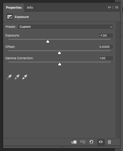
The first step in tonal manipulation was to add broad vignette-esque gradient with a negative exposure adjustment:
The mask:
And, the result:
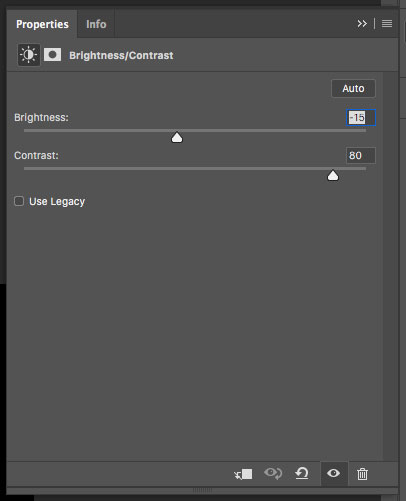
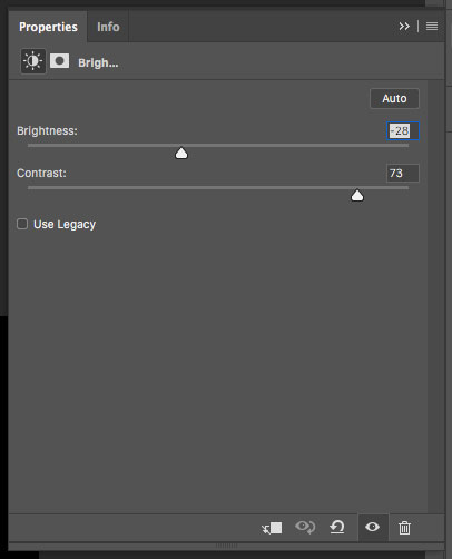
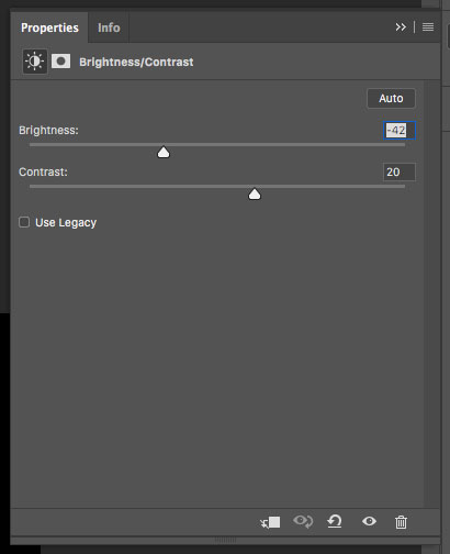
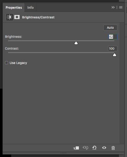
Alright. Now the roof and stairs no longer share the same tonal value. But, the stairs really aren’t the subject here, so let’s make them even darker. This time, I used a Brightness/Contrast adjustment. I didn’t just want to make the stairs darker. That’s too obvious of an edit. But, by dropping the brightness and upping the contrast, it’ll look more natural.
The Brightness/Contrast adjustment:
The mask:
And, the result:
Wait, didn’t I say this was going to look natural? This looks terrible. Let’s see if we can fix it with a gradient mask:
That’s better. I think we can work with this.
Wait, back up. How did you stack layer masks?!
The answer is significantly less graceful than I would prefer. I dearly wish you could simply apply two masks to one layer. But alas, you can not. So, you have to put the masked adjustment into a group and apply the second mask to the group:
Clunky but functional.
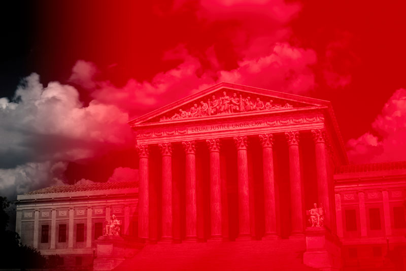
Since we’re in the lower portion of the image, let’s take care of some other non-subject bits and make them darker:
Not a lot covered here. Just a bunch of small stuff. Kind of Scene Simplification Round II, but by making things darker, not removing them. Remember, the human eye is drawn to highlights, so if there’s something you don’t want the viewer to waste their time looking at, just make it darker.
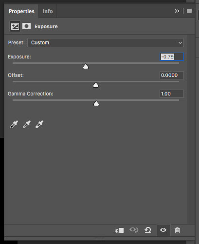
And, the result:
Not exactly a mind-blowing change. It's was only a -0.79 stop change. Just clean up really. So, let’s do some heavy lifting.
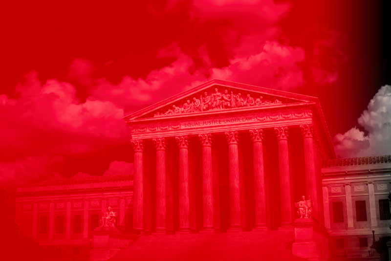
The left and right sides of the building and the definition of tonally flat. Let’s change that. Again, we’re going to drop the brightness and up the contrast:
The mask:
If this doesn’t have a big effect, I’m going to be rather upset ...

Finally, the sides of the building are no longer tonally flat! Again, I considered stopping here. I even stopped for an evening after getting this done. I was pretty sure I was done. But, when I came back the next day, I decided that I was very much so not done.
When you’ve gotten to the point where you think you might be done, taking a break and coming back to an image later will (hopefully) reveal to you areas that warrant improvement. A fresh set of eyes always helps.
Next up, an easy one. I wanted the blinds to be just a touch darker:

The mask:
And, the result:

Another not-exactly-earth-shattering change. But, subtlety is the path to success here.
Speaking of subtlety, let's make another massive change.
The more I looked at the columns, the more I realized I was going to have to do something with them. The second row and back wall simply can not be as bright as the front row.
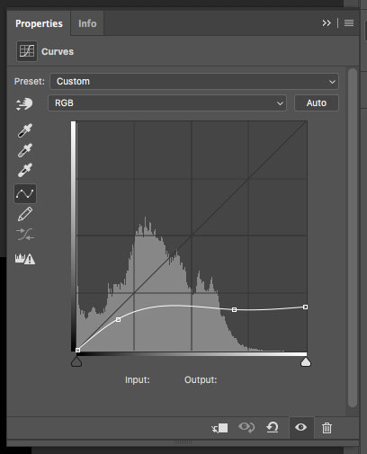
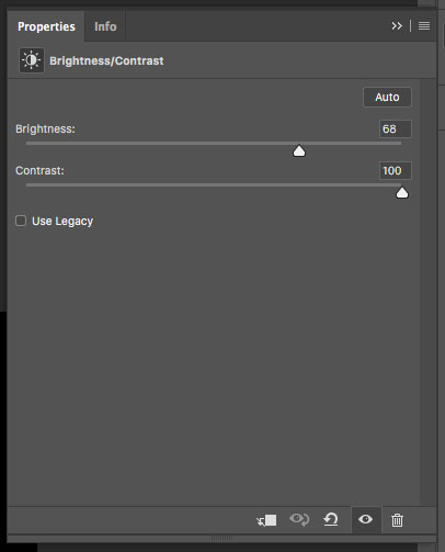
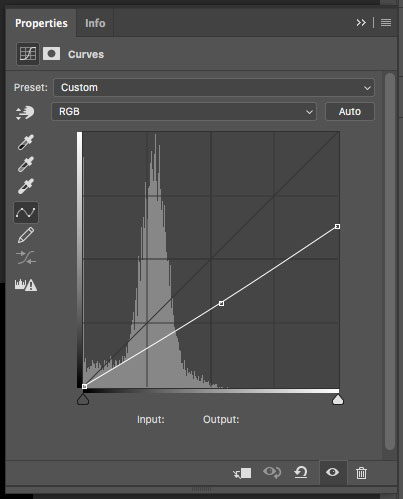
For the back wall, I wanted the bright spots completely gone. That meant matching the shadows. This turned out to be non-trivial. I tried an Exposure adjustment. I tried a Brightness/Contrast adjustment. I tried Curves. I tried Levels. Nothing worked. Lots of experimentation later, a combination of Curves, Brightness/Contrast, and Levels seemed to work the best:
Can I get a “Wow!” please? I mean, I’m impressed. Are you not? Ok, so it’s not perfect. It’s maybe a little too contrasty and the edges could certainly use some refinement, but I’d be inclined to argue that it still looks pretty damn good, eh?
Have I mentioned that I hand painted every single one of these masks? Yeah, no fancy Select and Mask nonsense for me. Just the good old fashioned Brush tool. Would I prefer to use the Select and Mask function instead of hand painting each mask? Of course I would, but I can’t seem to get it to make a useable mask to save my life. It seems to be great for selecting something for background removal and pasting into another setting; however, if you’re trying to select part of an image to modify it (not remove it), the Select and Mask tool doesn’t seem to be able to hand edges that are more than a pixel (or so) wide.
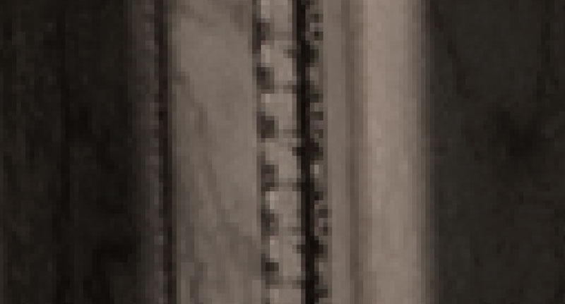
This is a 1200% zoom from the above chunk of back wall. Look at how wide that edge is from the shadow to the bright are. It’s at least 8 pixels wide. In my mind, it shouldn’t be that hard for Photoshop to select the bright area and make a smooth gradient in the mask for the edge. In practice however, I can’t get it to do anything like that. So, I choose a soft brush set to about twice the width of the edge and paint until I’m satisfied with the mask. It’s painful and time consuming, but it works better than anything else I’ve found.
I think I said earlier that I wasn’t going to dive into masking, so I apologize for the derailment. Let’s move on.
With the back wall taken care of I moved on to the secondary columns. Here, I wasn’t trying to match the shadows (otherwise I would have just added them to the “back wall” mask), so a single Curves adjustment sufficed.
The mask:
And, the result:
Hey, look at that! Now the front columns really stand out against the secondary columns and back wall. This really feels like progress. But, the front columns themselves are tonally flat. The direct sunlight completely flattened them. Wouldn’t it be nice if our big round columns actually looked round? Let’s see if we can do something about that with another Brightness/Contrast adjustment. Are you seeing a pattern yet?
The mask:
And, the result:
That’s more like it. I think I would have prefered a more pronounced difference between the dark side and the light side of the column, but that wasn’t really possible. I didn’t want to make the dark side any darker and couldn’t make the light side any lighter lest they compete with subject.
In making the comuns darker, the base of the columns now look too bright. Let’s fix that. I’ll give you 10 fake internet points if you can guess what adjustment I used ;)
Did you guess Brightness/Contrast? Good job.
Here’s the mask:
ERMAHGERD, you missed one!!! It’s ok, I know. I started to mask that one in, but when looking at it, it really didn’t need it. Take a look at the result and let me know if you still think I need to go back and add that one in:

How’s that look? Passably acceptable, I hope.
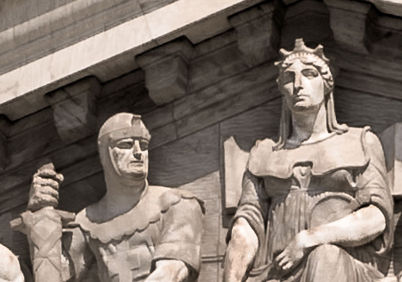
While the subject really is the top of the building, I also wanted to highlight the statues on either side of the stairs, so I did:
The rather unsurprising mask:
And, the glowing statue result:

What do you think? Too much? Well I rather like it, so I’m keeping it.
Finally, we arrive at the raison d'être, the roof. I call it the roof, because I am not an architect and don’t what what the front bit with all of the people, words, and fiddly bits is called. So, until someone educates me, it’s part of the roof.
First, let’s separate the people from the background by darkening the background a bit:
The mask:
And, the result:

Let’s go further. Let’s add a little more tonal contrast and darken their clothing:

The mask:
And, the result:

That was neat. Let’s do it again. But by “it”, I mean add more tonal contrast. This time, let’s brighten the people:
The mask:
And, the result:

We’re getting really close, but something is missing. Can you guess what it is?
You can’t read the words, so let’s ink them:

The mask:
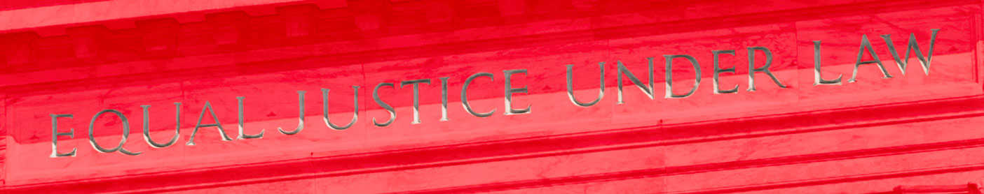
And, the result:

Boom sauce.
We’re done, right? That’s what “Boom sauce” means, right? Yeah, no. There’s always more!
Ok, not always, but in this particular case, there are two more things to do (in Photoshop).
Thing 1: burn the left side:
Editor’s Note: “Burn” in this particular context is referring to “Burn & Dodge”, not the more common “set something on fire”, though the Burn tool will not actually be used. "Burn" can, and apparently is, being used colloquially to mean “make darker”, which is effectively what the Burn tool does.
Editor’s Note to the Editor’s Note: The effect of the Burn tool is admittedly a bit more complicated than just “making it a bit darker”, but that’s what’s about to happen, so just go with it.
The mask:
Thing 2: burn the right side:
Editor’s Note: See the previous editor’s note(s).
The mask:
And, the result:
Looks pretty good, no? Have we achieved tonal separation between the foreground and background? Yes. Have we achieved tonal separation between the primary subject and the secondary portions of the building? Yes. Cool.
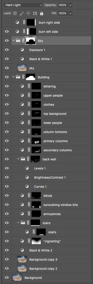
For reference, here’s the full layer stack:
And, we’re done … with Photoshop. Back into Lightroom we go!
But but, what could there possibly be left to do?
Don’t worry, just minor finish work is left. All of the heavy lifting is done.
Yay.
Fundamentally, this is an architecture piece. (Really, no way?!)
The fastest way to tell ameteur architecture work from professional architecture work is the presence or absence of the Keystone Effect. The Keystone Effect is what makes buildings look like they’re leaning away from you when you angle your lens upward. The effect isn’t overly pronounced in this shot because it was taken at 50mm. The effect becomes more pronounced as your focal length gets wider (and less pronounced as your focal length gets longer).
Unless you are specifically using the Keystone Effect to achieve your vision, it absolutely MUST be corrected. There are 2 ways to correct the Keystone Effect:
- The best method is to correct it optically with a Tilt-Shift lens. Since it is the best option, it is also the most expensive option. Nikon calls their tilt-shift lenses Perspective Control lenses. The entire rest of the world ignores Nikon’s naming convention and calls them tilt-shift lens.
- Nikon 19mm f/4 PC-E
- Nikon 24mm f/3.5 PC-E
- Nikon 45mm f/2.8 PC-E
- Nikon 85mm f/2.8 PC-E
- Canon 17mm f/4 TS-E
- Canon 24mm f/3.5 TS-E
- Canon 45mm f/2.8 TS-E
- Canon 90mm f/2.8 TS-E
- Rokinon 24mm f/2.8 TS for Nikon
- Rokinon 24mm f/2.8 TS for Canon
- Rokinon 24mm f/2.8 TS for Sony E Mount
- Rokinon 24mm f/2.8 TS for Sony A Mount
- The alternate (and significantly cheaper) method is to correct it in Lightroom.
Since I don’t own the 45mm tilt shift (thus why this image was shot with my 50mm), correcting the keystone effect in Lightroom was the only option.
Correcting in Lightroom can come a pretty serious downside though, so weigh your options (and budget) carefully. Since Lightroom is correcting the keystone effect by stretching, shifting, and cropping the image you are sacrificing resolution. The amount of resolution lost is dependant on how much stretching, shifting, and cropping is required to straighten the building. When shooting at 50mm or longer, the amount of resolution lost is normally acceptable. If you shoot at 14mm, really angle your camera up, and try to correct the keystone effect in Lightroom, you’re probably not going to be very happy with the result.
In Lightroom, there are several options for correcting the keystone effect, all of which are found in the Transform Module. For this image there are only 2 viable options: Vertical & Auto.
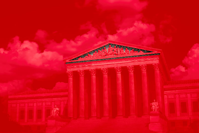
For reference, here’s the uncorrected image again:
Vertical correction vs Uncorrected:
Auto correction vs Uncorrected:
Auto correction vs Vertical correction:
What you’re seeing is an example of 2 point perspective vs 1 point perspective. Vertical correction maintains a 2 point perspective, while Auto correction reduces the view to a 1 point perspective.
It’s really your choice as to which version you like better. I opted for Vertical correction because I didn’t want to lose the sense of depth that comes from having the left side of the building be further away than the right side of the building. If I wanted only 1 point perspective, I would have stood in the center of the building. But, that’s not what I was going for, thus I stood off to the side. But again, this is all personal preference. Which version do you like better?
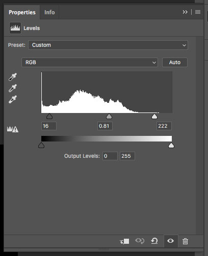
After selecting a keystone correction method, we turn to our old friend, the histogram. Once you’ve done everything else, the histogram should be your second to last stop when finishing an image.
Here’s the histogram for the image in its current state:
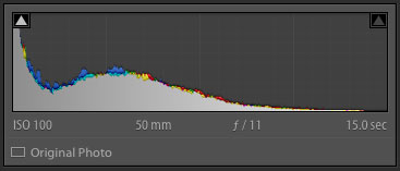
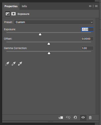
As you can see, it’s shifted pretty heavily to the left (which is fine since we’re going for an ominous ambiance). The problem is the gap on the right. That gap means we’re not making use of the full dynamic range. While there’s probably no room for pure white in this image, we can still boost the highlights and whites to get more dynamic range without changing the mood of the image.
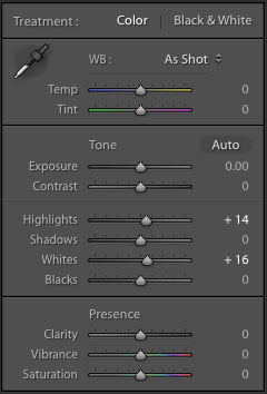
The new histogram:
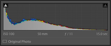
That’s better.
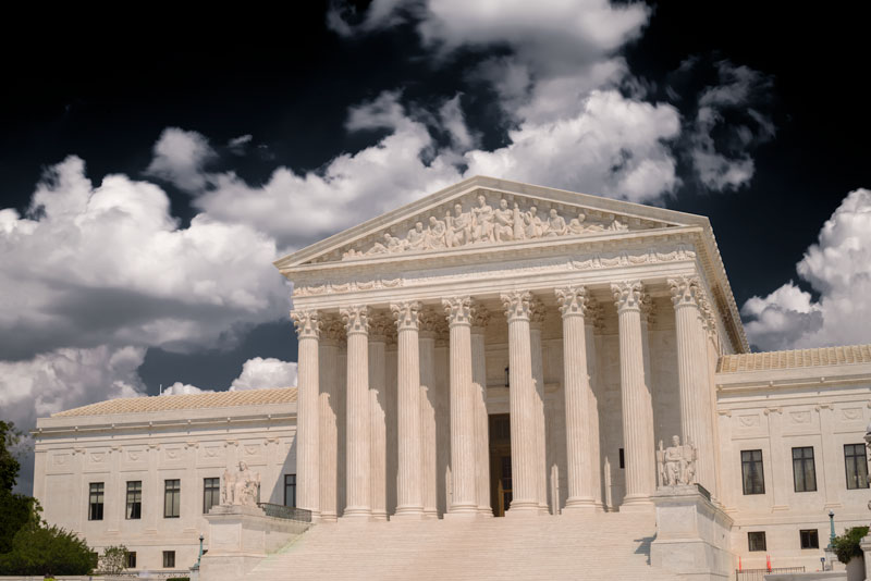
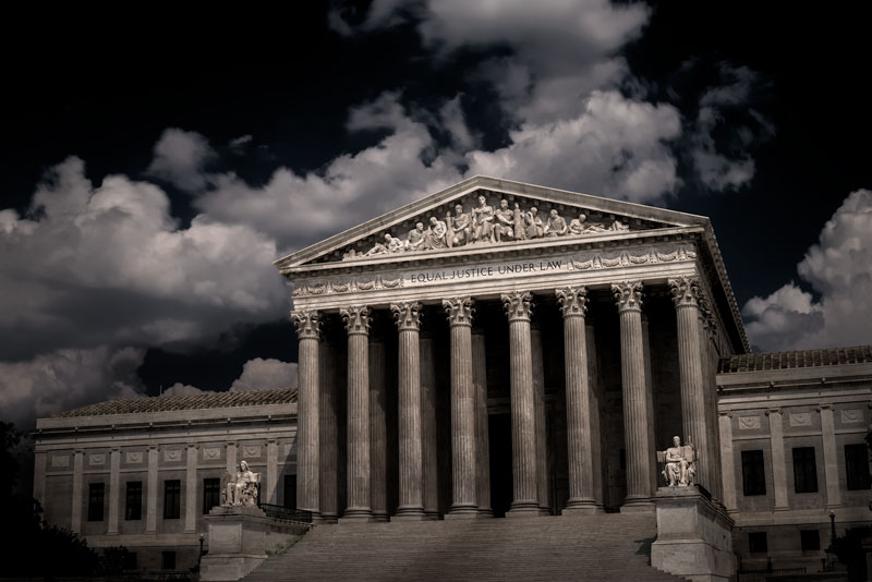
Here's, the result:

See a difference? It’s pretty subtle, but it’ll print better this way. In general, you should seek to maximize the dynamic range of an image, so long as it doesn’t change the overall feeling of the piece.
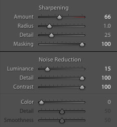
Last, but not least (ok, maybe least), is the Detail tab.
Here’s a zoomed in view of two of the upper people, no changes made yet:
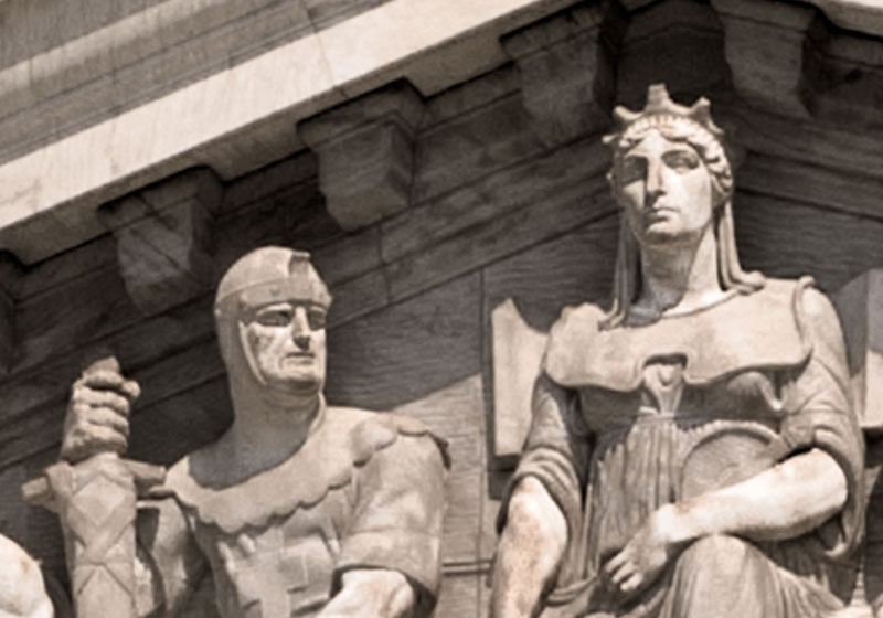
When you get that close, you can see it’s maybe not quite as sharp as we’d like. Is that a result of the keystone correction? Maybe. Diffraction from stopping down to f/11? Maybe. Was it some combination of those plus a multitude of other factors. Generally yes. I wouldn’t get too worked up about sharpness, but it (almost) never hurts to add a touch in right at the very end.
And, here's the result:
As you can see, it’s just a wee bit sharper than the untouched version. And that’s all we’re going for, slightly better.
After sharpening:
At web sizes, there is absolutely no difference between the unsharpened version and the final sharpened version. Sharpening only makes a difference if you print big, and I mean really big. And, even then, only if you get really close to it. Most (normal) people aren’t going to get within a few inches of your massive print to see how sharp it is on the pixel level. So, again, don’t get too worked about it. Focus on expressing your vision. That’s what really matters.
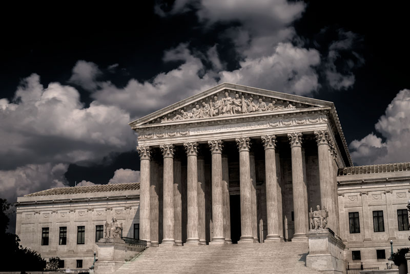
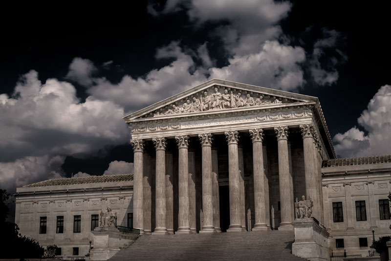
Final Comparison:
Are you still working on developing your vision? That’s ok. We all are. The real secret is not to go it alone. Art is not made in a vacuum. Bring a guide with you. And by that, I mean, Steal Like an Artist ;)
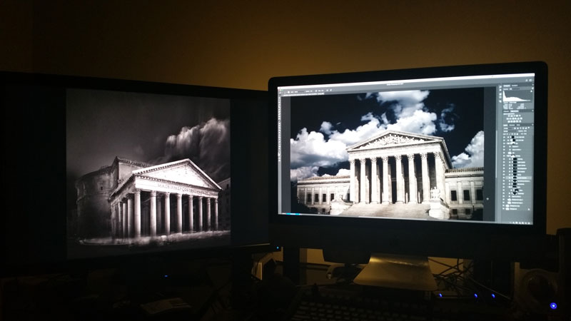
While I was working on the building, I had one of Joel Tjintjelaar’s images up on my second monitor. His understanding of tonal relationships is masterful. I can only hope to one day approach his level. So, until then, I use his work as a conceptual reference. Go find someone’s work that you really admire, wish to emulate, and do exactly that. The journey will teach you everything you need to know to forge your own path and develop your vision.
Limited edition prints are available in the print shop. Get yours today!